|
|
Post by cherokeescot on Feb 13, 2024 14:06:39 GMT -5
They actually paid someone to come up with this 😳  |
|
1hooper
UpInClass Steward
Posts: 6,746
|
Post by 1hooper on Feb 13, 2024 15:37:36 GMT -5
Needs some of Tiger's growth hormone.
|
|
5wide
UpInClass Member
Posts: 1,360
|
Post by 5wide on Feb 13, 2024 16:07:28 GMT -5
Very uninspiring, all round. The font looks like they didn't even try .
|
|
Badactor
UpInClass Member
Posts: 7,968
Member is Online
|
Post by Badactor on Feb 13, 2024 17:35:09 GMT -5
That's terrible... and designers get big bucks for their work. I joined Screen Actors Guild in 1991. These were the logos: SAG and the American Federation of Television and Radio Artists. 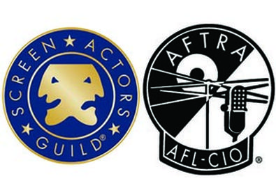 When merger happened in 2012, word at the convention was the newly formed union paid $180,000 for this design: 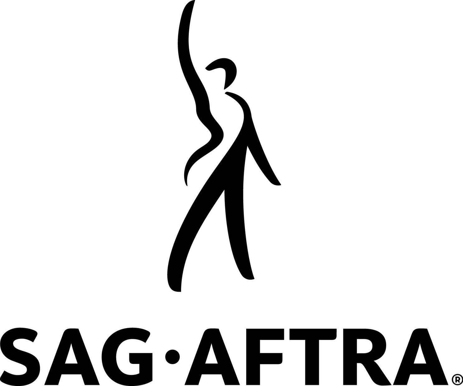 I think it looks like a guy in a tux hailing a TAXI! Perhaps, a Maitre d saying "your table is ready." |
|
|
|
Post by tenfurlongs on Feb 13, 2024 18:47:18 GMT -5
He probably wanted mine, but wouldn't pay up... _(edited)_tw.png) TW
|
|


.jpg)